really
excited to showcase our new
self-service POS and mPOS offerings
, but how would we stand out among a sea of exhibitors, including Silicon Valley giants? Trade shows are packed with product announcements, industry news, and photo-worthy booths. How do you stand out from the crowd?
Read on for tips from our team on how to create a memorable, successful trade show booth.
1. It’s all in the experience
What’s the first thing that comes to mind when you hear the words "trade show booth?" You might imagine the traditional booth -- a curtained backdrop, a draped display counter, and free swag covered in corporate logos.On their own, these traditional booths are a great way to connect with consumers on a more personal level and can prove to be highly successful.
However, it’s all too easy for trade show attendees to pass over a traditional booth setup, especially when it's surrounded by dozens of similar setups. In reality, standing out at a trade show requires much more effort than buying fancy swag.

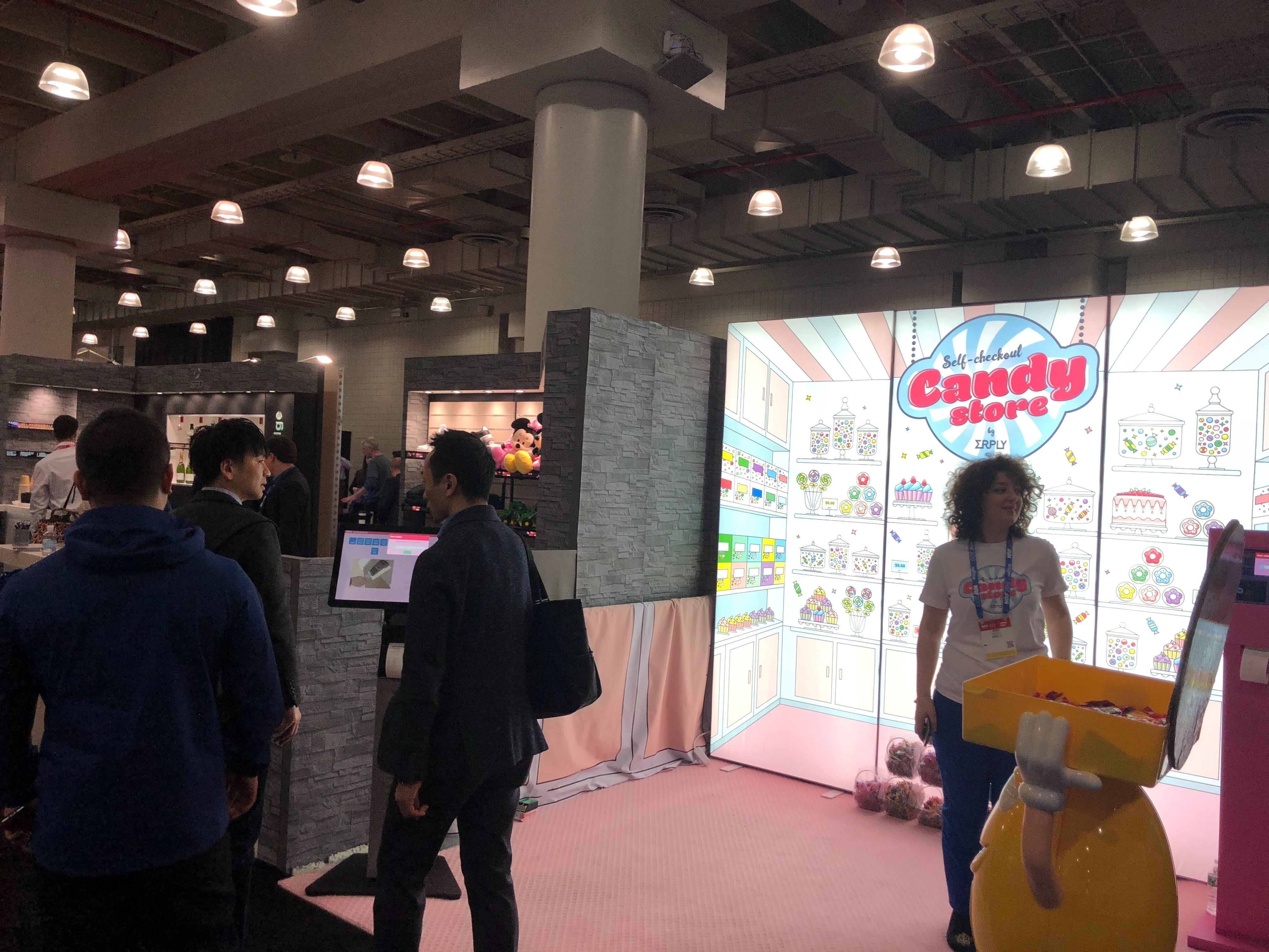
Our advice? Move away from the traditional booth and create an experience. In our case, we opted to transform our booth into a free self-checkout candy store.
Erply had 2 broad goals in mind:
- Showcase our new self-service POS and mPOS.
- Get people talking about our business.
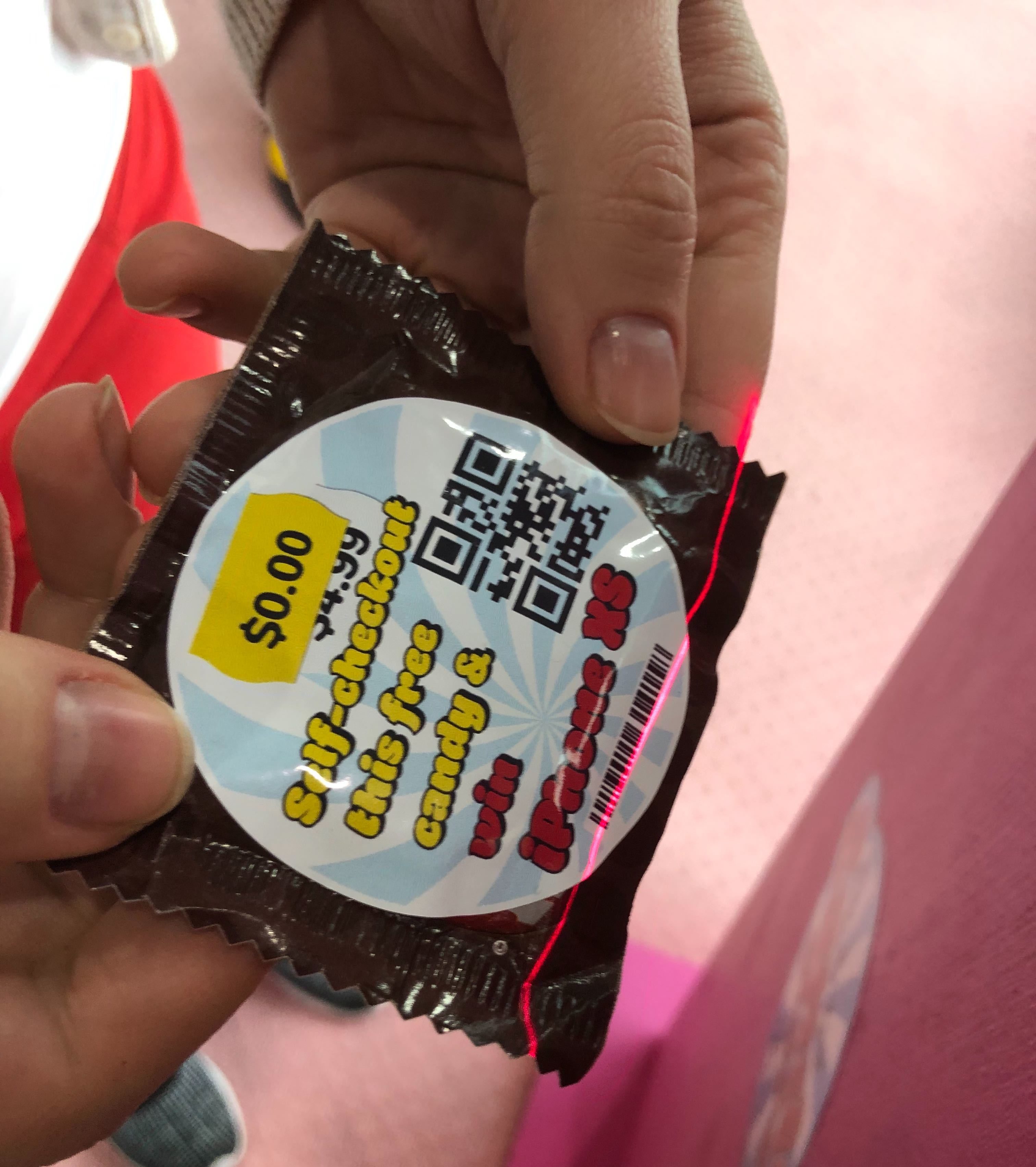
In our candy store booth setup, "customers” were able to walk up to our booth (ahem, store), grab as much free candy they’d like, and use our self-service POS to “check-out” their order.
It was fun, unique, and stood out from traditional walk-up booths. Plus it included free candy, which is always a winner.
Most importantly, the self-checkout candy store setup got people using our new self-service POS. Encouraging these interactions didn’t just help us get our product in front of retailers, partners, and analysts -- it also helped us gain valuable feedback on our software.

2. Be bold
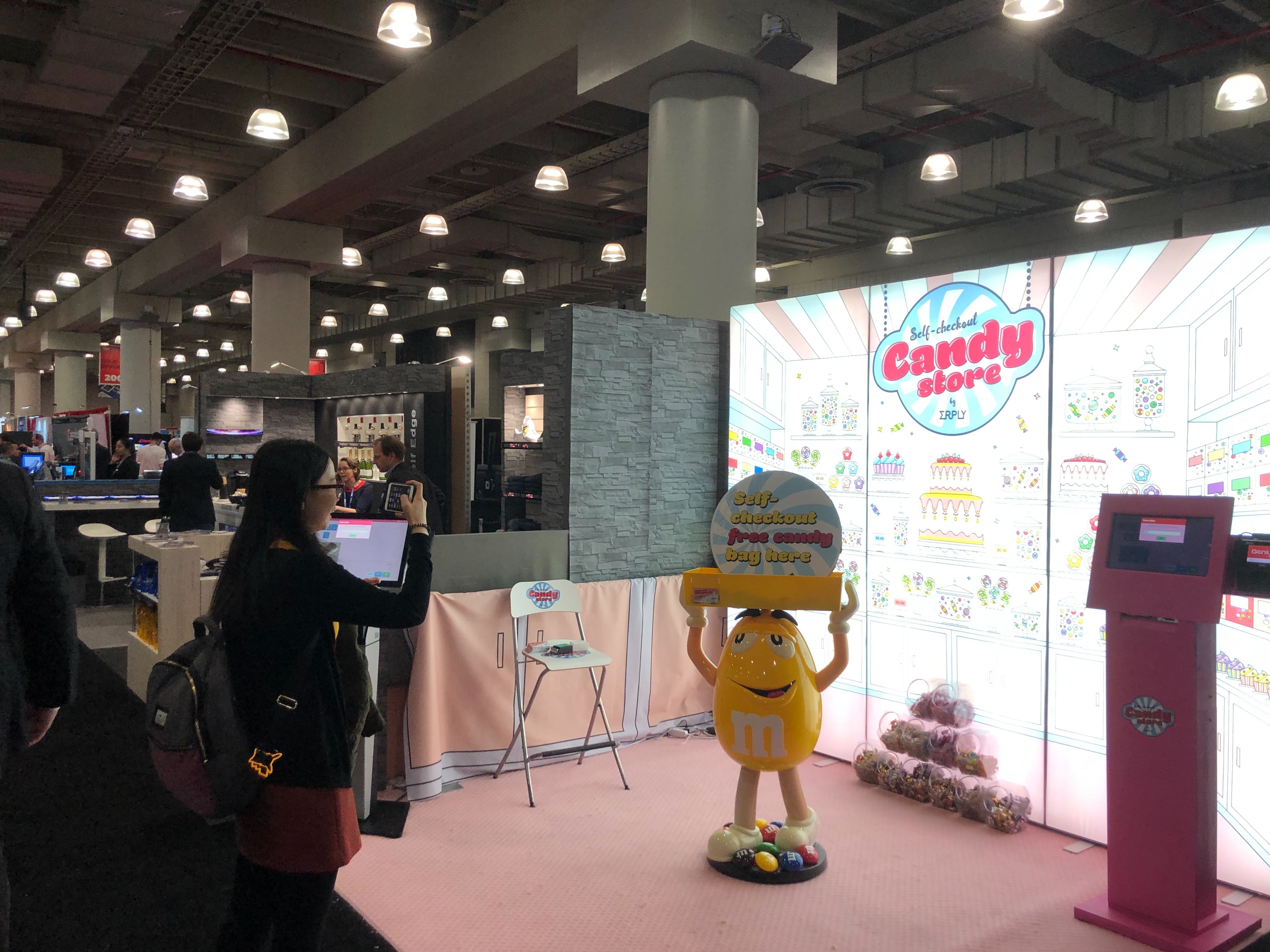
Gray and light blue definitely make for a sleek look, but in a trade show full grays and blues, it’s easy for those colors to get lost in the crowd.We broke away from our typically light blue logo and went pink. The Erply candy store was built out of a handmade pink kiosk, a pink rug, and a pastel LED backdrop designed with a cartoon-style candy store.
Is pink part of Erply’s identity? No. And that’s okay! While we’re definitely a fan of brand consistency (our website even matches our product), we know when it’s time to break out the creative guns.
The results? Lots of attention -- and photos! (yes, please keep photographing our company logo) Visitors consistently commented on how eye-catching out booth was, especially compared to the muted colors that surrounded us. Read more about those comments in our booth media blog
!
On another note, we didn’t purchase a large island booth. Our candy store operated out of the classic 10x10 booth space. Get creative and invest in creating an experience to maximize your booth's impact.
 We do think it’s important to note that you should refrain from going
 too
bold. Flashing graphics, an overly bright booth, or aggressively clashing colors can definitely deter visitors.
Think: if you wouldn’t want to stand in your booth for too long, neither will visitors.
3. People appreciate authenticity
Given that Erply is a software company, creating a recognizable, authentic candy store experience took a bit of thought and internal brainstorming.We very easily could have gone with standard trade show furniture, displayed bowls of candy, and called our booth a self-service candy store. As long as people are using our self-checkout app, it’s still a success, right?
Wrong!
Comparing past NRF experiences to our self-checkout candy store taught us that allocating more resources into the experience yields more successful results. With that principle in mind, we did our best to give our booth a true authentic candy shop feel.
Front-and-center of our booth was a giant M&M character. It might seem silly (some of us were admittedly skeptical at first), but it got people talking! Candy stores typically
are
filled with fun, silly props. Our M&M fit right in.
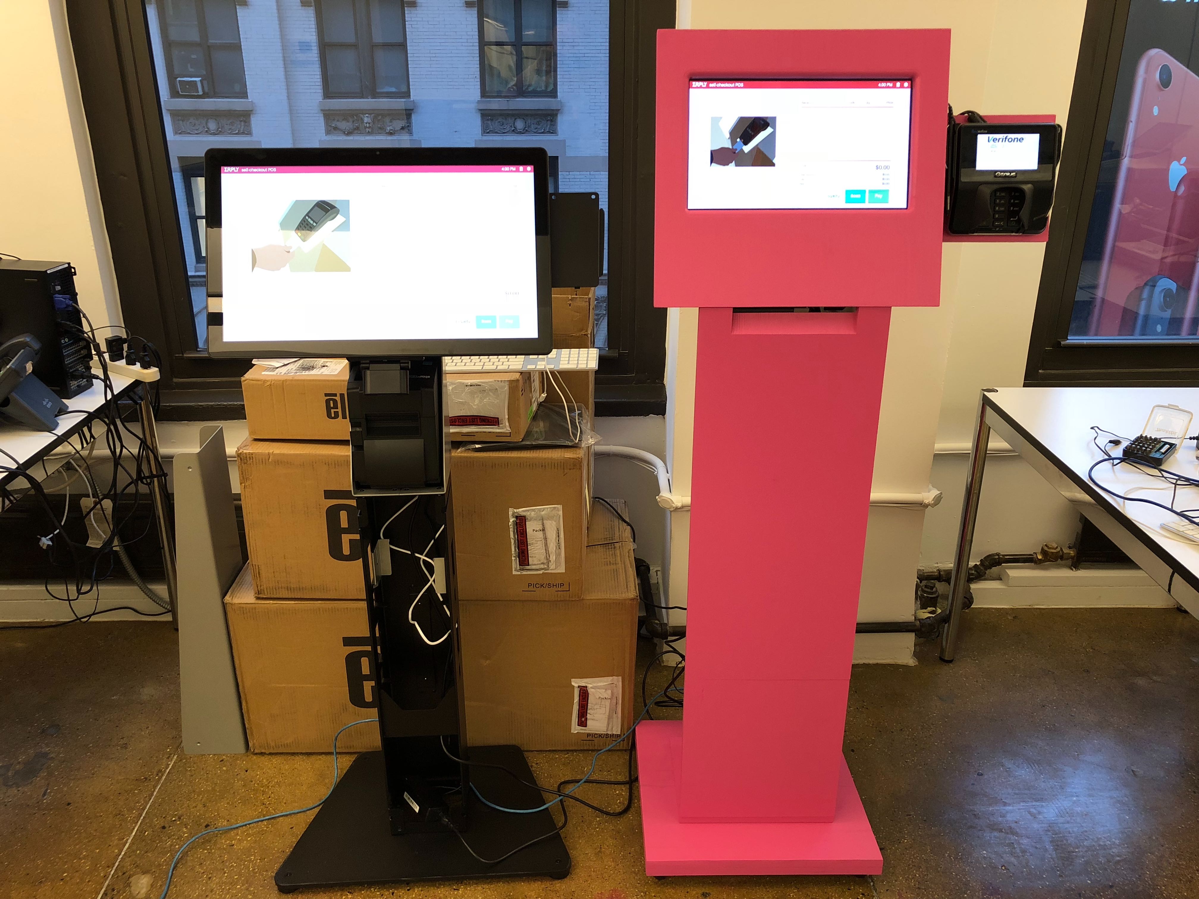
 As much as visitors loved the M&M character, without a doubt the real star of our booth was our handmade self-service POS kiosk.
 The kiosk was put together from hand-cut wood and given a shiny coat of bubblegum pink paint. Erik, one of Erply's hardware specialists, put a lot of time and effort into creating a unique kiosk, and the results really paid off.
If anyone had told us that the handmade kiosk would draw as much attention as it did, we would have made 3 more.
Your next booth might not be a self-service candy store, but hopefully these insights can help you plan your next trade show booth experience.