 We at ERPLY believe that a great product not only has great functionality but is visually appealing with an intuitive design. For this reason, all of our designs are made by, or in cooperation with the best designers in Estonia. This dedication was recently recognized at the IX Tallinn Design Festival, with an award for Service Designs. ERPLY is proud to be recognized. amongst so many talented designers and candidates. Our visual story started early in our company's history and has continued into all of our offerings.
 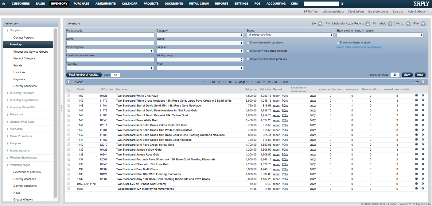 Rewind back to 2009, the same year we won Seedcamp, one of the most talented UI designers in the country- Oliver Reitaly- created our ERPLY Back-office UI design which is still largely in active use today. Our back office had to overcome a few hurdles in design. The software itself is immensely powerful inventory tracking and management software, but it also had to be easy and intuitive to use, quick to navigate and provide tons of information on nearly every screen. We have made some changes since then, but this layout has served our customers well.
 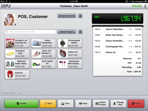 Following our Series A round, we launched our first iPad app 'POS' (short for Point of Sale) in 2010 which is still in active use by thousands of users. This represented a nice jump into mobile POS systems which incorporated not just sales documents, but inventory tracking and credit card payments in one system, easily used on an iPad. The programmable quick buttons, save sales capability, and ability to print receipts to a mobile or stationary printer were featured our customers often praised. Fast forward a few years, and much experience, we made the decision that using the latest HTML5 for UI would be the next big thing, and bring our customers a nicer, smoother, more functional experience. So we partnered with Jaak Parik and created the next generation Touch POS UI - and product. This product also matched iPad func
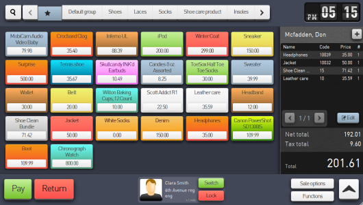 tions and looks to the desktop/browser version, allowing our hybrid mobile/standard setup customers to only train their employees once, and simplify their POS experience. Views on this app were toggle-able between the colorful 'quick serve' view and the more utilitarian scan-to-add 'retail' view. TouchPOS also brought save-and-move functionality, view customization, product group organization for quick buttons, and a host of other functionality to our iPad and browser POS, all while maintaining ease of use for clerks and staff.
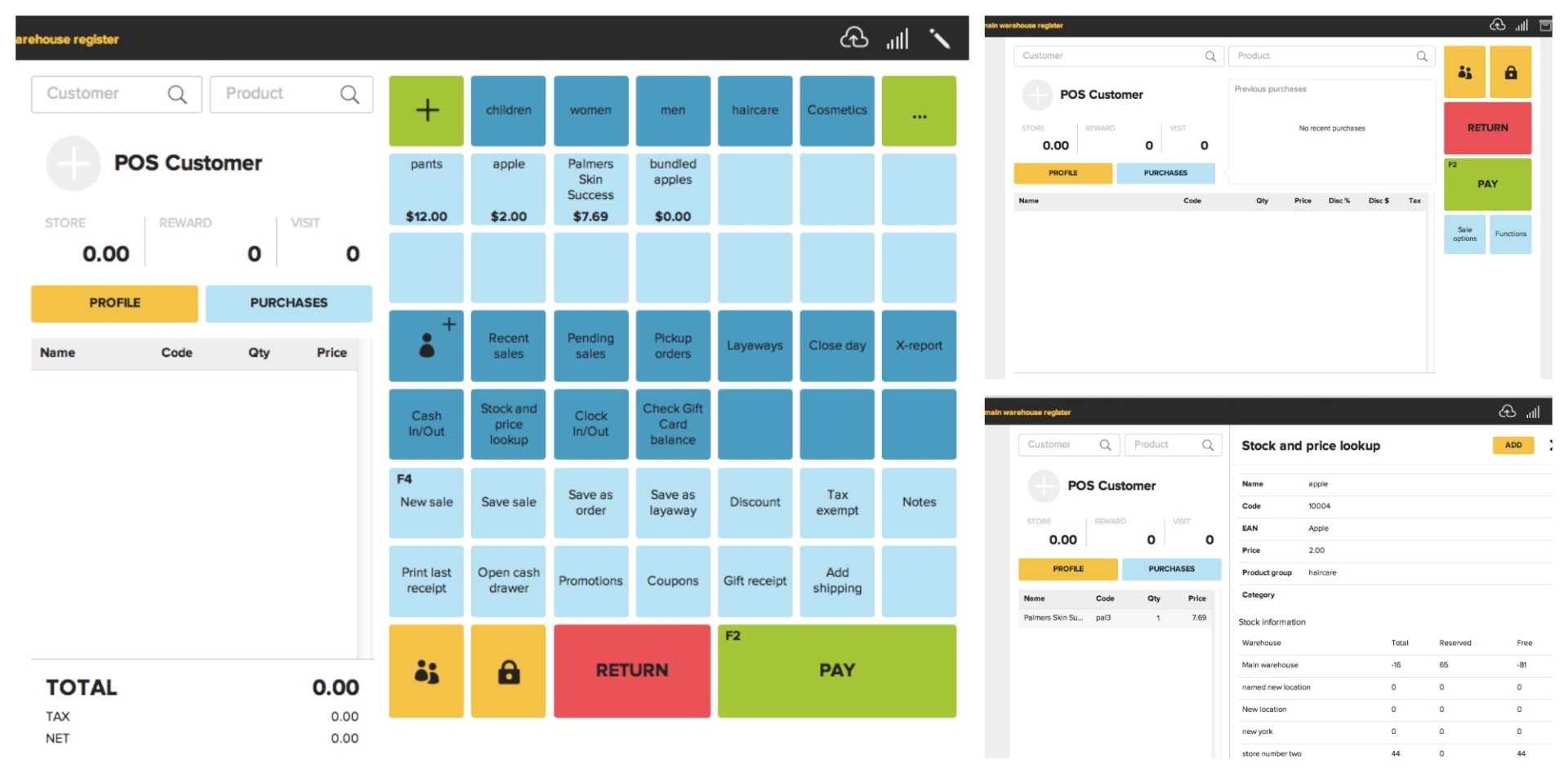
Now, in 2014, together again with designer Oliver Retailu our team created next-generation interface, codenamed BerlinPOS, product - which won the Estonian Design Award 2014. Usability and flexibility were our main goals (so touch and retail views are united under the same umbrella), our newest POS is an available cross-platform, usable on everything from iPad to Windows OS.
We keep improving and always asking for help from great designers to integrate the functionality and visual quality - our product must be not only usable in business but also enjoyable! Congrats to our design team on a job well done, we're looking forward to seeing how we improve in the future.
 If you have any feedback on our design or you would like to ask us about our new version, please contact us at support@erply.com. Recently ERPLY has also been runner-up for an Estonian American innovation award.